Work / HPB Healthy 365
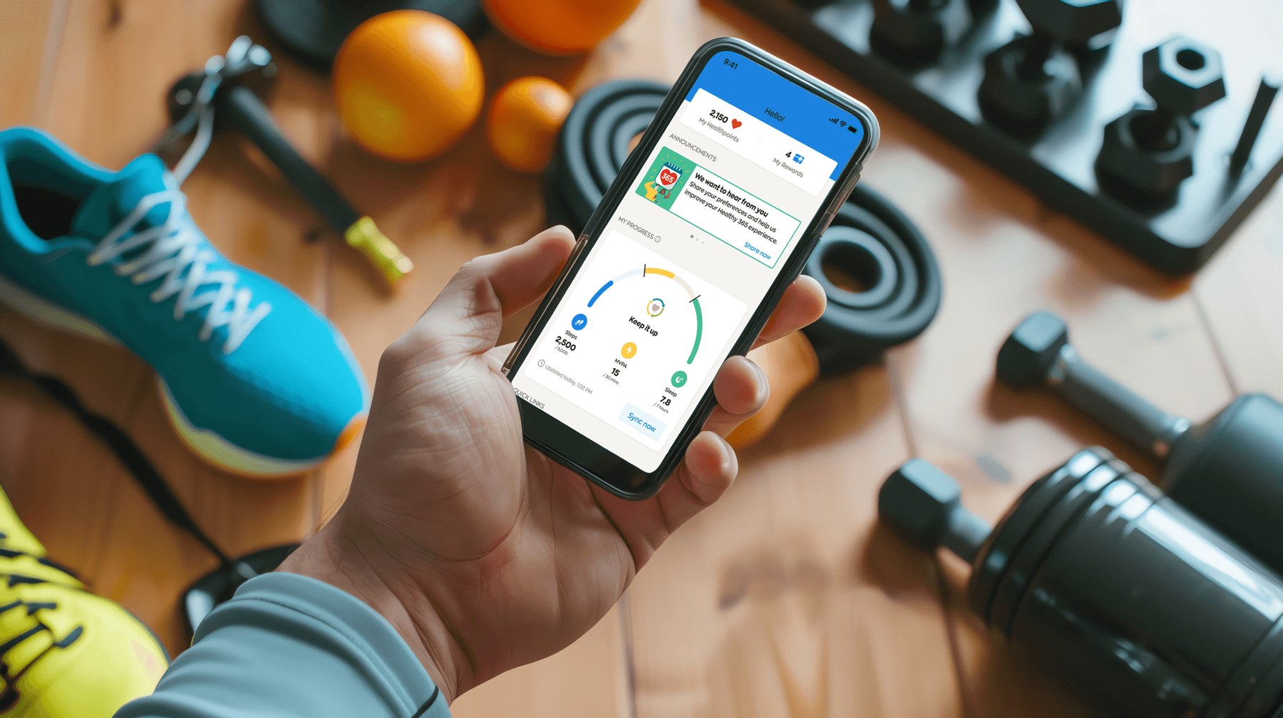
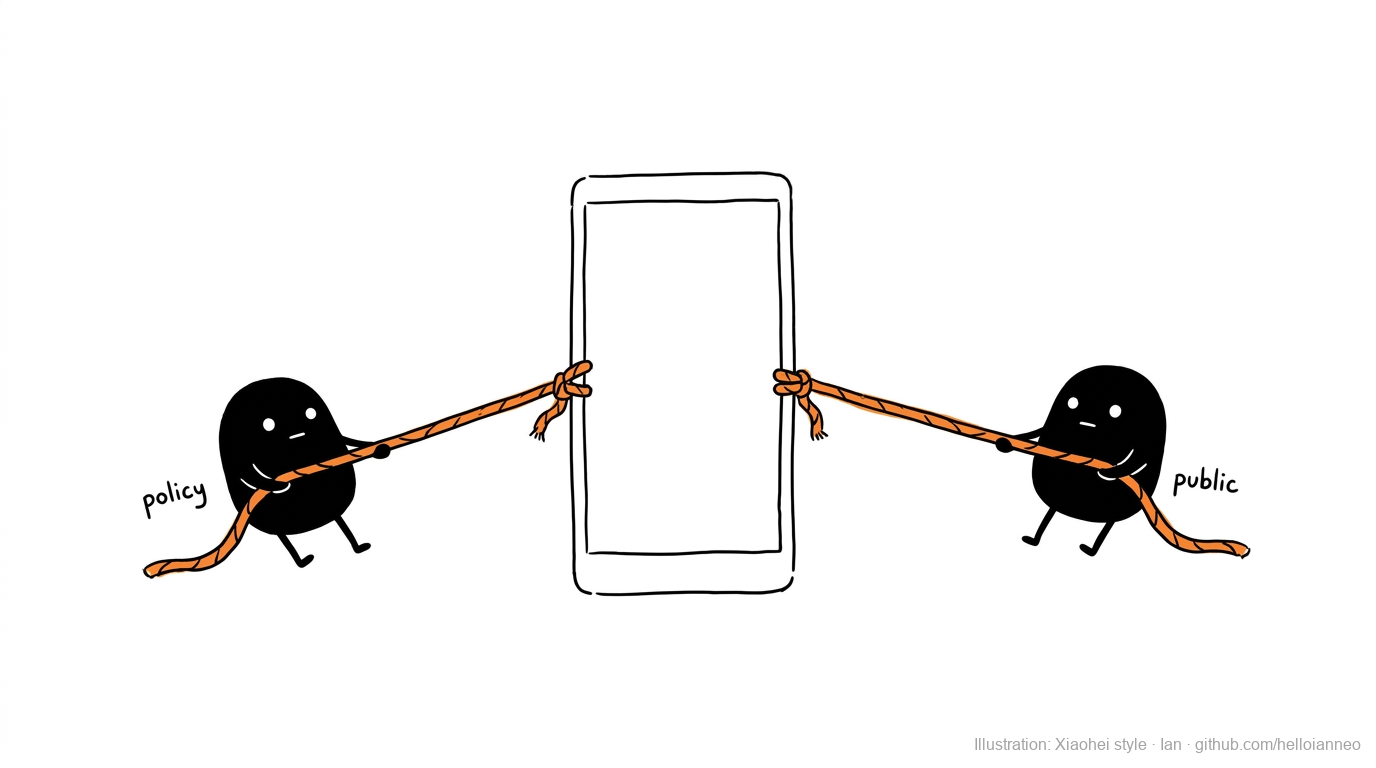
HPB Healthy 365 · Embedded design programmeThe government uses it to move health policy forward. The public uses it to track their own health and earn rewards. Two sides of one screen, pulling in different directions. Over three years, the way we kept both working was to make each new policy feel personal: not a target handed down, but something the person holding the phone chose for themselves.
At a glance
About the programme
By the time we came in, Healthy 365 was already a mature national platform: an established shape, millions of users, and the technical limits that come with both. We were not designing from a blank page. We were improving a product millions already relied on, without breaking what worked.
Most of the work arrived as new initiatives from the programme team, each one a policy goal that had to become something the public would actually want to open. Our job was to sit in that gap, between what the initiative needed to achieve and what a real person would tolerate on their phone. And what closed the gap was rarely a new feature. It was making the policy goal feel like the person's own.
The challenge
Every screen had to answer to two sides at once. The programme team needed it to move a health policy forward: more steps logged, better eating, higher participation. The public needed a reason to keep opening it that had nothing to do with policy. Serve only the first and people stop using it. Serve only the second and it stops earning its place in the national programme.
And the public was never one person. The same screen met a retiree checking their steps, a parent chasing rewards for the family, someone who barely trusted an app with their data. One policy, many motivations, different comfort with sharing, different levels of health literacy. A single generic design would have failed most of them.
And we could not simply redesign our way out. The platform was mature, its structure fixed, its integrations load-bearing. Whatever we improved had to happen inside those walls, not by knocking them down.
The process
Every initiative started the same way: a policy goal on one end, a mature codebase on the other. Before proposing anything, we mapped what the platform could actually support, so what we designed could ship, not just look good in a deck. Working within the limit, instead of wishing it away, is what let the ideas land.
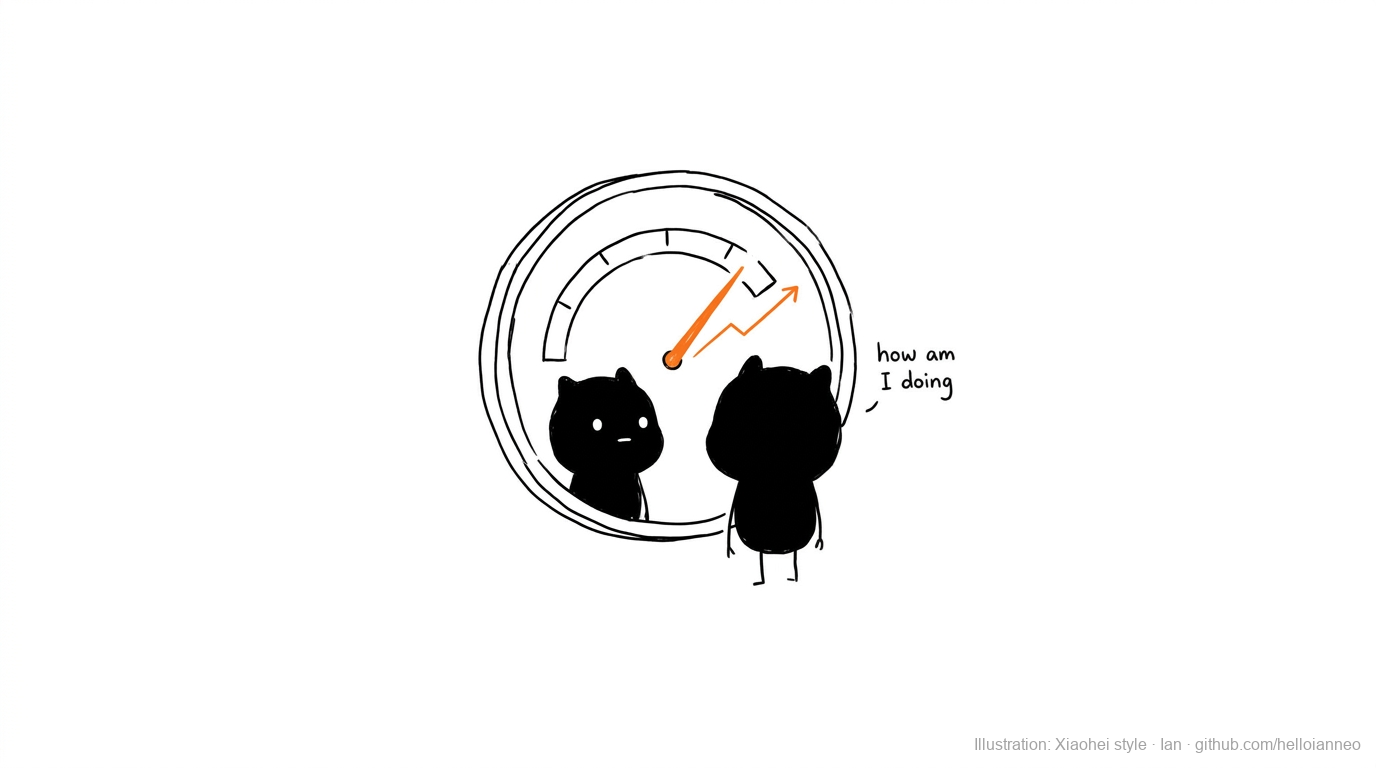
The Activity Dashboard rebuilt the home screen around the one question a user actually asks: how am I doing? A flat readout became an animated, personal view of your progress toward goals you set yourself: 5,000 steps, seven hours of sleep, 150 minutes of exercise a week. And the same screen had to serve two very different people. The already-active never think about how points are earned; they just want to confirm their Healthpoints landed. Others live by the daily goals. So we built the tracker onto a challenges surface that holds both, and can scale as more tactical and multi-programme challenges arrive.
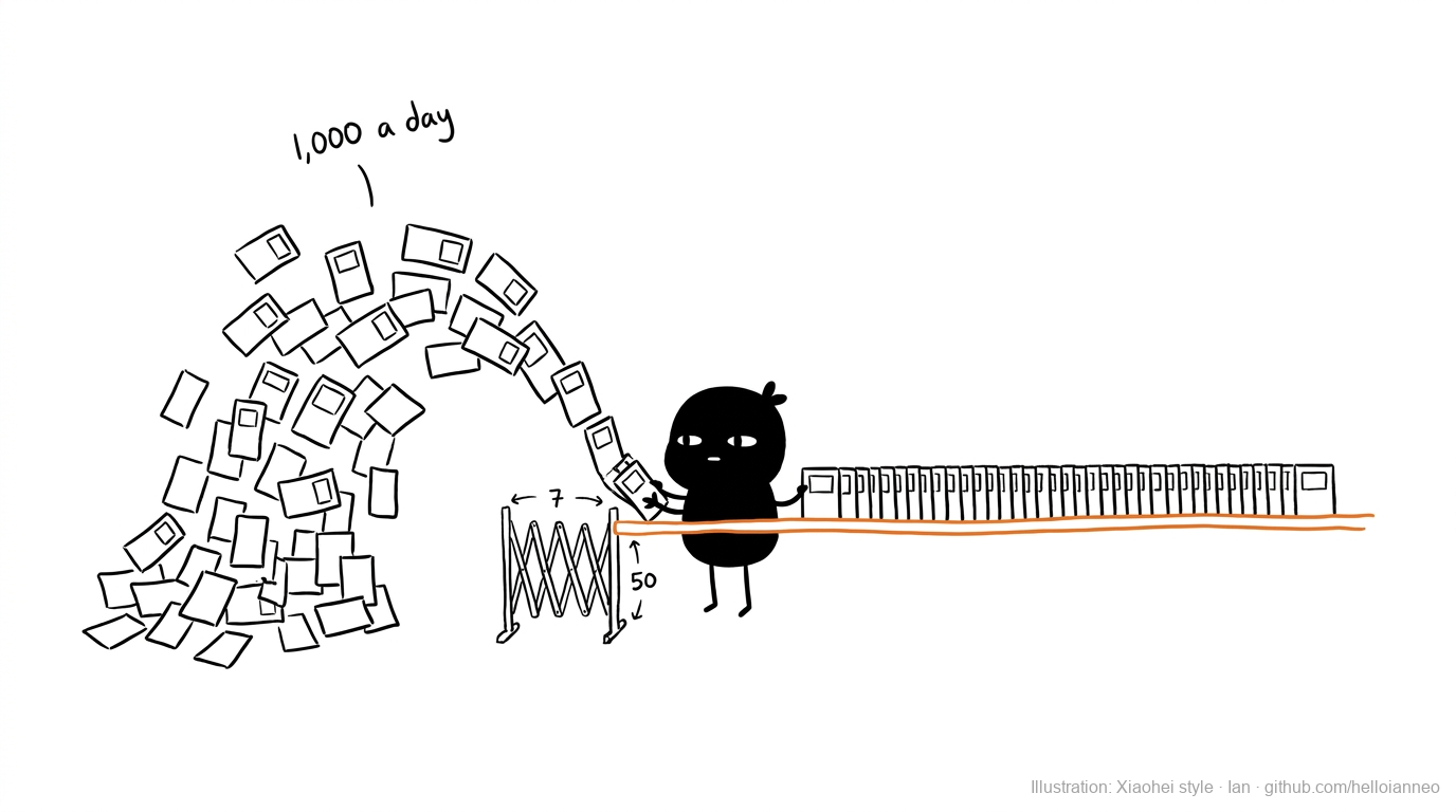
Healthy 365 lists more than a thousand events a day, pulled from a growing roster of partners. A single filter cannot carry that. So we designed two systems, not one: a light experience for when there are fewer than seven partners, and a heavier one built to hold up to fifty. We also fixed the list itself, surfacing what people decide on before they tap, like how intense a session is and whether it is free or paid, so choosing an activity stopped being a guess.
The public split into audiences that barely overlapped, and each campaign meant learning to think like them. Grow Well SG put us in a parent's shoes: how do you add a child to your account and bring them to an event without friction? Age Strong asked for a different mind again, people motivated by collecting vouchers through simpler, safer exercise. We wanted a game of chance as a bonus and ran into a firm limit, because a game of chance is legally gambling, and policy would not allow it.
Special Challenges was our most rigorous piece, closer to a behavioural science experiment than a feature. The principle underneath it was user autonomy: people sustain behaviour they choose, not behaviour pushed on them. So we designed it to be tested, not guessed. Users were split into randomised groups so we could isolate one lever at a time: whether a personalised challenge beats the standard one, whether a stretch goal pulls people further, whether the wording of a message changes what they do, and whether letting people pick their own challenge matters most of all. Out of that, we found a baseline combination that held.
Then tech limits pushed to strip the challenge title and its timebox out of the design. We fought to keep them. They are not decoration. They are the context a person needs to understand what the challenge is and how long they have, and users lean on both to make sense of everything else. Cut them, and even the sharpest behavioural design lands on someone who no longer knows what they are looking at.
The contested moment
Most decisions were collaborative. This one we argued for. The tidy instinct was to assign health targets: measurable, uniform, easy to report. But people sustain goals they set themselves, not ones handed to them. Pushing for that autonomy meant designing straight through a split public. Younger users asked why the government should hold their fitness data at all. Older users assumed the opposite, that since the government already holds their data, it should simply decide what is best for them rather than ask. Neither is wrong. Building one system that respected both, without imposing on either, is autonomy at its most demanding.
Results
Beyond the design
Most of what made this work never showed up in a mockup. Every initiative ran through me before it ran anywhere else: I took the brief, shaped the implementation plan, and put a real number on the effort, then assigned the work across the team once it was won. Three of us, including me, carried the rest: the dashboards and event system I led on directly, the campaigns and behavioural experiments, and the pieces my team built out, from the chatbots to the badge system.
With that little resource against that much surface, the strategic calls mattered most: what to build once and reuse, where three pairs of hands would do the most good each week, which battles with policy and engineering were worth having. We had to be our own project managers, occasionally our own lawyers, and above all UX experts for anything that landed on us. It was relentless, and it was the fastest any of us grew into the product world, because nothing was ever someone else's job to figure out.
What stayed with me
The hardest problem in public health design is not the interface. It is making a policy goal feel like a personal one, on a screen someone opens by choice.