Work / Singapore Customs
Singapore Customs · Information architecture & contentA high-traffic government website serving 3.9 million visits a year. The content was accurate and well maintained. What was broken was how anyone found it, especially on mobile, and especially for first-time visitors who were not even sure they were on the right agency's site.
At a glance
About the project
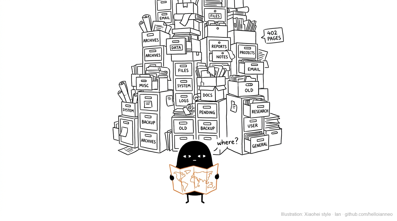
The agency knew its subject matter. What had accumulated over the years was structure shaped by the organisation chart: content grouped by the department that owned it, not by the task a visitor arrived to complete.
There was a complication we could not design away. Many visitors were not sure they were on the right government site at all, confusing this agency with a related one. Fixing the brand confusion was out of scope. So the navigation had to be clear enough that people could still reach what they needed even while uncertain where they had landed.
The challenge
Professionals who used the site daily had built workarounds. First-time visitors gave up before finding what they came for. Almost none of it was reported, because people do not complain to a government website; they route around it. The research had to actively look for friction users had stopped mentioning.
The process
Before touching a single page, I scoped research across three distinct groups: individual members of the public, external business users, and the internal officers who process what the site generates. The findings put numbers to the pain: in testing, the site's own search sent people away empty-handed every single time, a hundred percent abandonment, and first-time visitors rated their confidence in finding anything near the floor.
Every page was mapped, assessed, and assigned a fate: keep, rewrite, merge, or retire. The audit revealed the core pattern: structure mirrored departments, while users arrived with tasks. The same task often crossed three departmental sections.
Rather than jump to one answer, I built two. Version A was radically user-centric, organised entirely around tasks. Version B was a safer evolution that kept the organisation's existing shape. I documented the trade-offs of each, user impact against implementation complexity, and pressure-tested the task-based model against how global customs authorities structure the same content, from Australia to US Customs and Border Protection to New Zealand. The client asked for a blend of the two, and that became Version C: the user-first spine of A, made buildable by the pragmatism of B.
The new architecture regrouped everything into task-based actions. Content was rewritten throughout to prioritise what users needed to do, not what the organisation needed to say. Mobile was rebuilt as a primary surface rather than an afterthought, within the constraints of the whole-of-government platform the site runs on, which meant I negotiated what the system allowed rather than designing in the abstract.
Post-revamp validation went back to all three user groups. The sharpest movement came from the group that had been struggling most: first-time individual users.
The contested moment
Departmental structure is comfortable for the organisation: every team can see its own content. Task-based structure is comfortable for users and uncomfortable for everyone who loses a dedicated section. I held that position by showing each stakeholder, with their own users' research in hand, that being findable matters more than being visible.
Results
The brand confusion that sent people to the wrong agency's site in the first place remains unresolved; it was outside our scope and still is. The honest claim is narrower: when people land here, even uncertain, they can now find what they came for.
What stayed with me
Government platform users do not complain. They build workarounds and come back and try again. The real design work is actively looking for the friction people have stopped reporting.